0of17read0 XP
Create graphs, charts, or other visualizations to convey the results of data analysis using specialized software.
Apply statistical procedures to structured datasets to produce graphs and visualizations (histograms, bar charts, pie charts) using specialized software [^4][^5].
- Time
- 20–25 min
- Type
- exercise
- Bloom
- Apply → Create
- XP
- 100
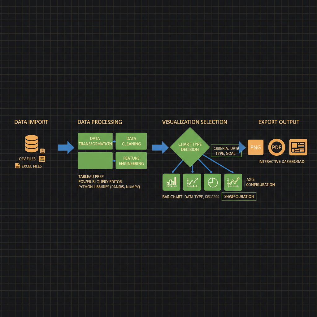
Architecture diagram for Create graphs, charts, or other visualizations to convey the results of data analysis using specialized software.. The data visualization workflow from raw dataset input through analysis software to final output formats. The diagram should display four main stages connected by directional arrows: data import (database icon with CSV/Excel files), data processing (transformation and cleaning steps in rectangular boxes), visualization selection (branching decision diamond leading to bar chart, line graph, pie chart, and heatmap options), and export output (multiple format icons for PNG, PDF, and interactive dashboard). Include labels for specialized software tools like Tableau, Power BI, or Python libraries at the processing stage. Use a left-to-right horizontal layout with blue for data flow arrows, green for processing boxes, and orange for output formats. Add small annotation boxes showing key decisions like chart type selection criteria and axis configuration.
You'll be able to
- Apply statistical procedures to structured datasets to produce graphs and visualizations (histograms, bar charts, pie charts) using specialized software [^4][^5].
- Create accessible data presentations that support decision-making by organizing complex information through data analysis and visualization tools [^4][^5].
- Evaluate the appropriateness of different visualization types (static illustrations, graphs, charts, dynamic visualizations) for conveying specific analytical results to technical and non-technical audiences [^8].
- Manipulate dynamic data visualizations to extract insights and interact with graphical representations of analytical findings [^4][^5].
- Produce graphs, charts, and other visualizations that convey data analysis results in accordance with the requirements specified in NVIDIA Certified Associate exam task 3.4 [^2].
Key concepts · tap to reveal
1/17·Idea
0%
Idea
01 / 17
The Black Box Problem
You've just trained a custom LLM to detect toxicity in user-generated content. After 72 hours of fine-tuning on a GPU cluster, your stakeholder asks: "So, did it work?" You have validation logs, perplexity curves, and confusion matrices scattered across three Jupyter notebooks, but no single artifact that answers the question at a glance. Without a clear visual summary—loss curves overlaid with baseline performance, precision-recall trade-offs by toxicity category, or a heatmap of misclassified edge cases—your expensive experiment remains a black box, and the decision to deploy or retrain stalls.
Your task Write a prompt that asks Claude to recommend the right AI setup for a real task you're facing — then weigh its answer against this lesson, "Create graphs, charts, or other visualizations to convey the results of data analysis using specialized software.."
a strong prompt:role · context · task · format · example
Exercise · scenario
## Scenario **Difficulty Level:** Applied You are a machine learning engineer preparing to present the results of a fine-tuning experiment to your project stakeholders. You have collected performance metrics (accuracy, F1 score, and inference latency) across five different hyperparameter configurations. Your audience includes both technical team members and non-technical executives who need to understand which configuration best balances model quality and speed. The NVIDIA certification exam expects candidates to demonstrate the ability to produce graphs, charts, or other visualizations that convey analysis results using specialized software[^1][^2]. You have access to Python libraries (Matplotlib, Seaborn, Plotly) and need to decide which visualization types will most effectively communicate trade-offs between competing metrics to a mixed-expertise audience. **What would you do, and why?**
Deliverable
You will produce a **Jupyter notebook** (`.ipynb`) that visualizes the results of a generative AI experiment using at least three distinct chart types. The notebook must load real or synthetic data (for example, training loss curves, token-count distributions, or bias-detection scores), apply **statistical procedures** to produce graphs and other visualizations such as **histograms**, **bar charts**, and **pie charts** [^4], and include markdown cells that interpret each visualization with inline citations to the data source.
Practice · Scenarios
0 of 8 revealed
Scenario 1 of 8
A financial services firm uses a generative AI model to detect anomalous trading patterns across 200 currency pairs over 18 months. The model flags 3,400 suspicious events with associated risk scores (0-100), temporal clustering, and correlation networks between pairs. Compliance officers need to prioritize investigations but lack machine learning expertise. The analytics team considers a time-series line chart with anomaly markers, a network graph showing correlated suspicious pairs, or a risk-score histogram with temporal facets.
Sources
- [1]NVIDIA-Certified Associate: Generative AI LLMs (NCA-GENL) Study Guide·NVIDIA-Certified Associate: Generative AI LLMs (NCA-GENL) Study Guide (2026) · Vendor
- [2]DigComp 2.2 (EU Digital Competence Framework, JRC128415)·DigComp 2.2 (EU Digital Competence Framework, JRC128415) (2026) · Vendor
- [3]OpenAlex API·OpenAlex API (2026) · Vendor
- [4]arXiv API·arXiv API (2026) · Research
- [5]arXiv API·arXiv API (2026) · Research
Submit your work for review
Paste your capstone artifact below. You'll get back a 4-level rubric grade, per-criterion feedback, and three concrete edits to strengthen it.