0of21read0 XP
Create graphs, charts, or other visualizations to convey the results of data analysis using specialized software.
Apply statistical procedures to structured datasets to produce graphs, charts, and other visualizations (histograms, bar charts, pie charts) using specialized software [^4].
- Time
- 20–25 min
- Type
- exercise
- Bloom
- Apply → Create
- XP
- 100
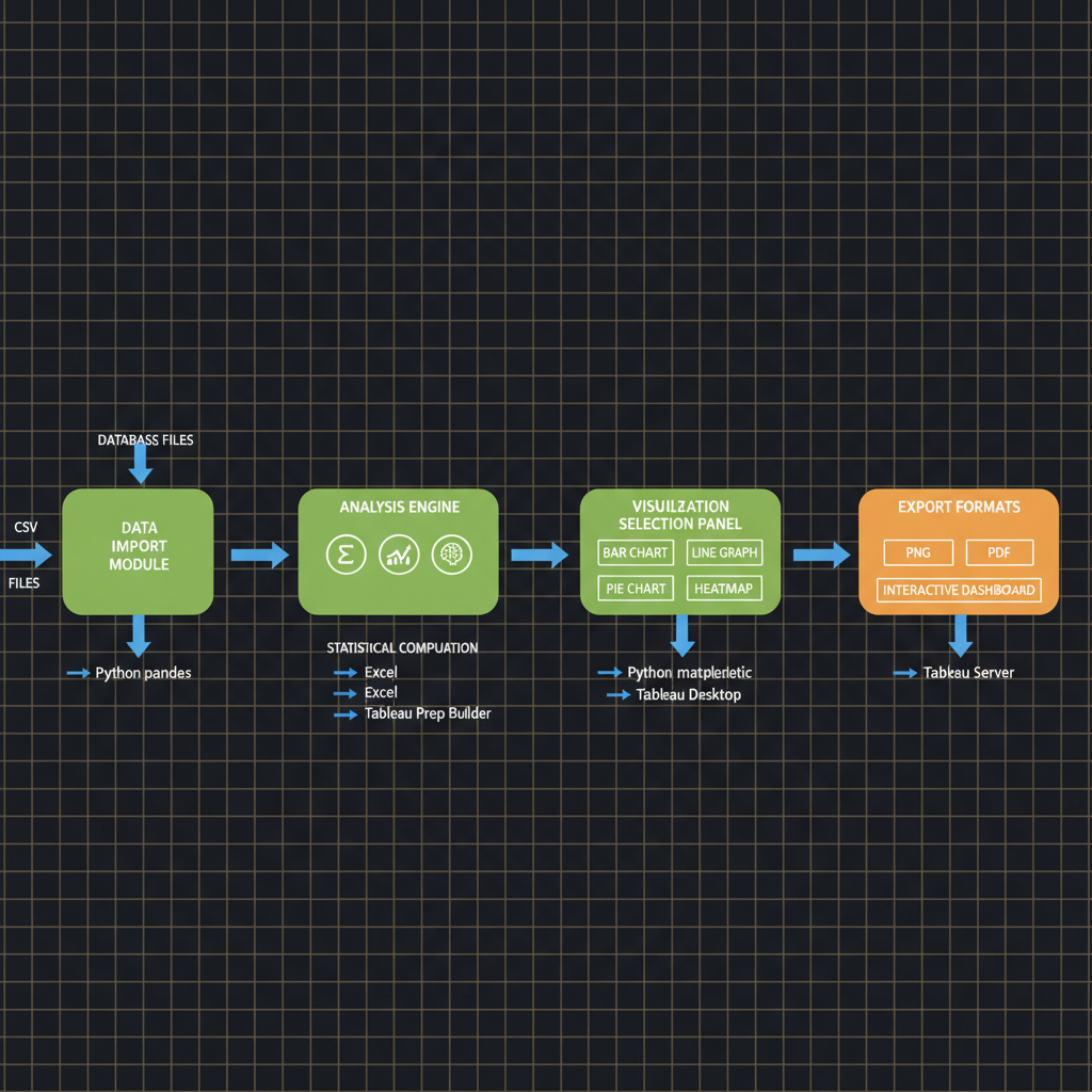
Architecture diagram for Create graphs, charts, or other visualizations to convey the results of data analysis using specialized software.. The data visualization workflow from raw dataset input through analysis software to final output formats. The diagram should display four main stages connected by directional arrows: (1) data import module receiving CSV or database files, (2) analysis engine with statistical computation icons, (3) visualization selection panel showing bar chart, line graph, pie chart, and heatmap options as distinct boxes, and (4) export formats including PNG, PDF, and interactive dashboard. Use blue for data flow arrows, green for processing nodes, and orange for output options. Include labels for software tools like Python matplotlib, Tableau, or Excel at relevant stages. Position elements left to right in sequential order with clear spacing between stages.
You'll be able to
- Apply statistical procedures to structured datasets to produce graphs, charts, and other visualizations (histograms, bar charts, pie charts) using specialized software [^4].
- Create accessible data presentations that organize digital data in ways that support decision-making and problem-solving [^4][^5].
- Evaluate dynamic data visualizations by manipulating interactive graphs and identifying appropriate visualization types for different analytical contexts [^4].
- Classify different visualization formats (static illustrations, graphs, charts versus dynamic animations) based on their suitability for conveying specific data analysis results [^8].
- Generate graphs, charts, or other visualizations to convey data analysis results using specialized software, as required by the NCA-GENL exam task 2.4 [^1].
Key concepts · tap to reveal
1/21·Idea
0%
Idea
01 / 21
Why visualization determines whether analysis drives action
You've trained a model achieving 94% accuracy, but when presenting results, your team lead asks: "How does loss change across epochs? Which hyperparameters correlate with better performance? Where does the model fail most often?" Without visual evidence, your breakthrough sits in a spreadsheet no one will read, and deployment stalls. The ability to transform raw metrics into clear charts and graphs determines whether your analysis drives action or gets ignored.
Your task Write a prompt that asks Claude to recommend the right AI setup for a real task you're facing — then weigh its answer against this lesson, "Create graphs, charts, or other visualizations to convey the results of data analysis using specialized software.."
a strong prompt:role · context · task · format · example
Exercise · scenario
## Scenario **Difficulty Level:** Applied You are a machine learning engineer preparing a quarterly review for executive stakeholders who will decide whether to expand your team's generative AI pilot program. Over the past three months, you have collected performance metrics on three candidate LLMs: response latency percentiles, token costs per 1,000 requests, and bias detection scores across six categories. Your manager has asked you to present the findings in a format that enables non-technical decision-makers to compare the models quickly and understand trade-offs between cost, speed, and fairness[^1][^2]. You have access to Python visualization libraries, cloud-based dashboards, and spreadsheet tools that can produce **histograms**, **bar charts**, and radar charts[^4][^6]. However, you know that poorly chosen visualizations can obscure patterns or introduce cognitive load that prevents stakeholders from grasping key differences[^8]. **What would you do, and why?** Which visualization types would you select for each metric category, and how would you justify your choices to ensure transparency and support decision-making[^4]?
Deliverable
You will produce a **Jupyter notebook artifact** that implements an end-to-end data analysis and visualization pipeline for a generative AI experiment of your choice (for example, token distribution analysis across prompt variations, bias detection frequency by model, or inference latency trends).
Practice · Scenarios
0 of 8 revealed
Scenario 1 of 8
A municipal transportation department has analyzed 200,000 citizen complaints processed by an LLM-powered categorization system over 12 months. The analysis reveals complaint volumes by category (potholes, traffic signals, parking, transit delays), geographic clustering by neighborhood, temporal patterns by day of week and season, and resolution times. The city council requires a visualization for a public hearing that demonstrates system effectiveness and identifies underserved areas requiring infrastructure investment. The audience includes both technical staff and community members with varying data literacy levels.
Sources
- [1]NVIDIA-Certified Associate: Generative AI LLMs (NCA-GENL) Study Guide·NVIDIA-Certified Associate: Generative AI LLMs (NCA-GENL) Study Guide (2026) · Vendor
- [2]DigComp 2.2 (EU Digital Competence Framework, JRC128415)·DigComp 2.2 (EU Digital Competence Framework, JRC128415) (2026) · Vendor
- [3]OpenAlex API·OpenAlex API (2026) · Vendor
- [4]arXiv API·arXiv API (2026) · Research
- [5]arXiv API·arXiv API (2026) · Research
Submit your work for review
Paste your capstone artifact below. You'll get back a 4-level rubric grade, per-criterion feedback, and three concrete edits to strengthen it.